Role
UX/UI Designer
Duration
4 Weeks
Physicians, Medical Students, Residents, Medical Staff, AMA Staff
Team
Lead (A.Matkovich), Stakeholders (R.Wells, J.Capaldi), Project Manager (J.Russell), Developer (J. Thorne), Product Manager (J.Metz)
Overview
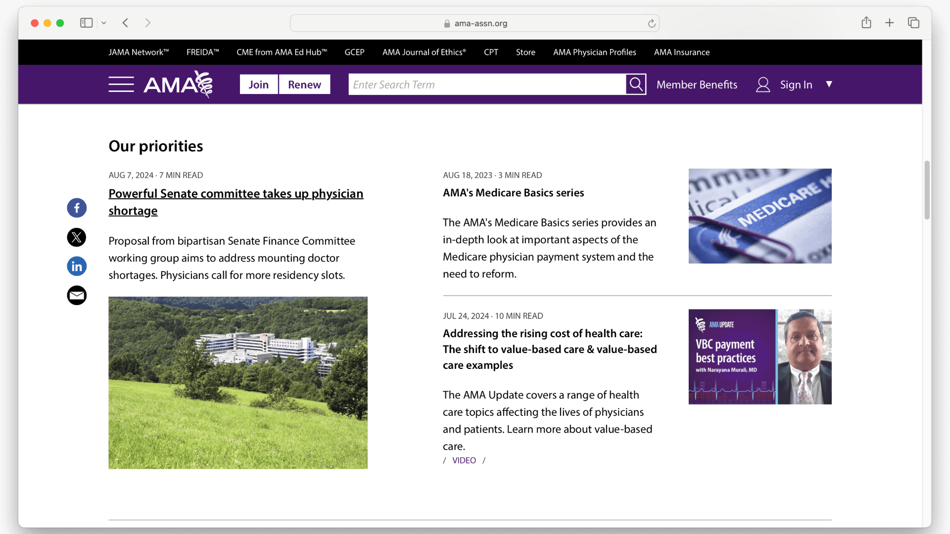
The leadership at the American Medical Association tasked me with updating the Category Page to ensure the website's quality matched the high standard of the news and resource content provided.
Scope & Constraints
The project was driven by analytics, relying on secondary research from sources like Baymard and heat maps from Quantum Metrics. This approach limited our understanding of user frustrations, making recommendations more challenging. Midway through, the introduction of project managers required an adjustment period. Additionally, development faced delays due to early-year sprint issues. The change encompasses the entire category page creating several components in the process. It was one of the last projects we completed where we worked on an entire page template at once.
Process
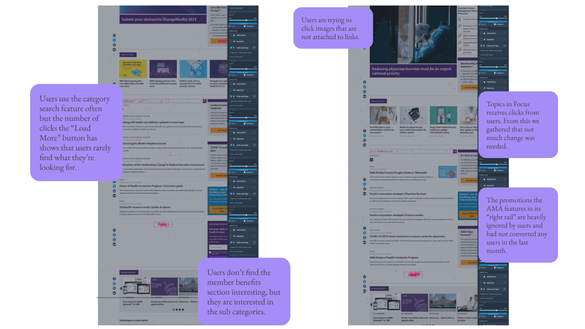
I conducted secondary research using Baymard and Norman Nielsen articles, analyzed Google Analytics for popular category pages, and reviewed click maps in Quantum Metrics. I also interviewed subject matter experts.
Key Findings:
Secondary Research: Category pages are crucial for wayfinding, helping users navigate without a specific topic in mind.
Stakeholder Interviews: The AMA's website was seen as lacking professionalism and needed clearer category definitions.
Research and Analysis
Whiteboard Sketches
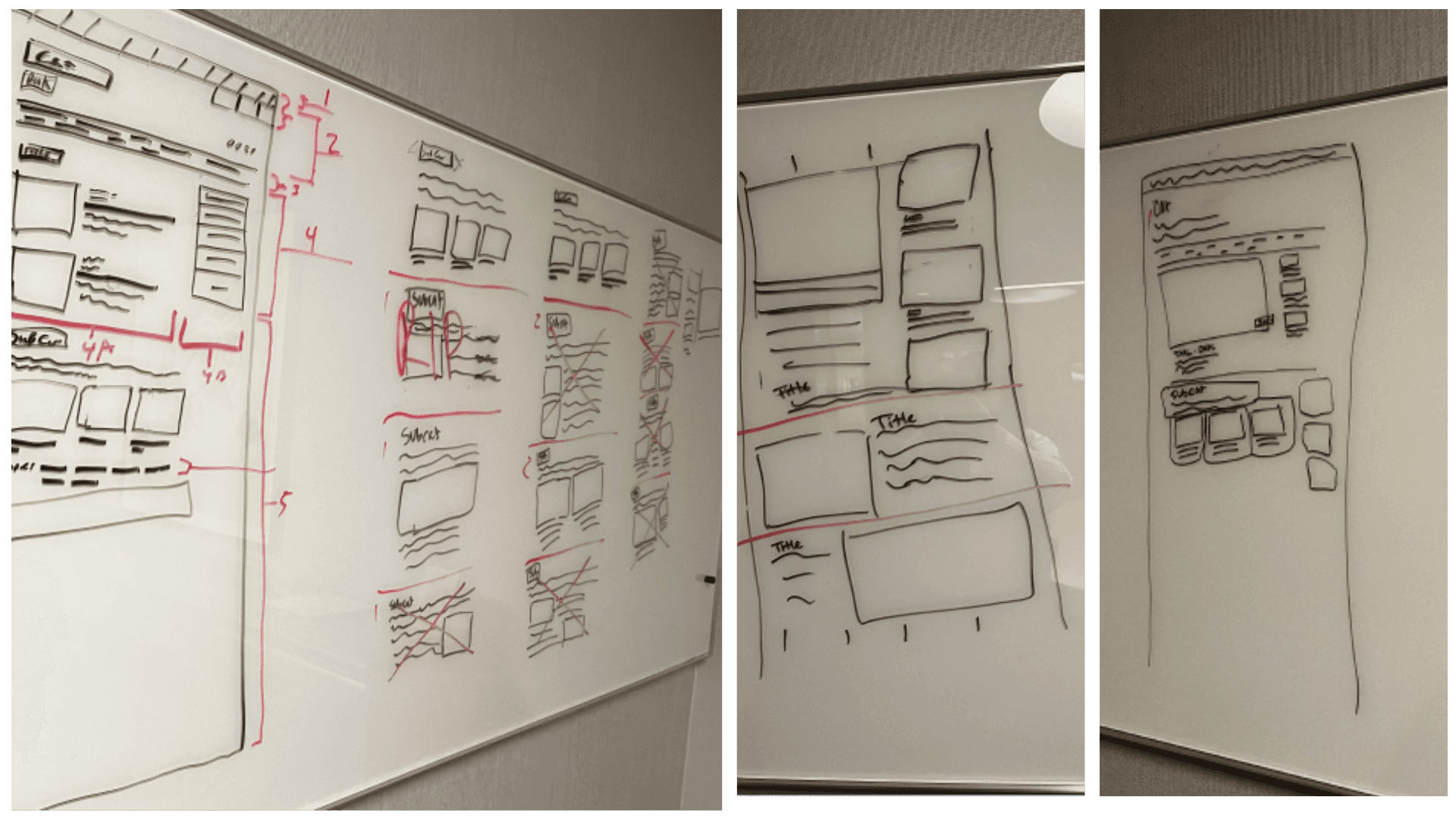
Our team lead and I sketched out all the components on the category page and attempted to rearrange them in a way that made the most sense to stakeholders and users.
Options
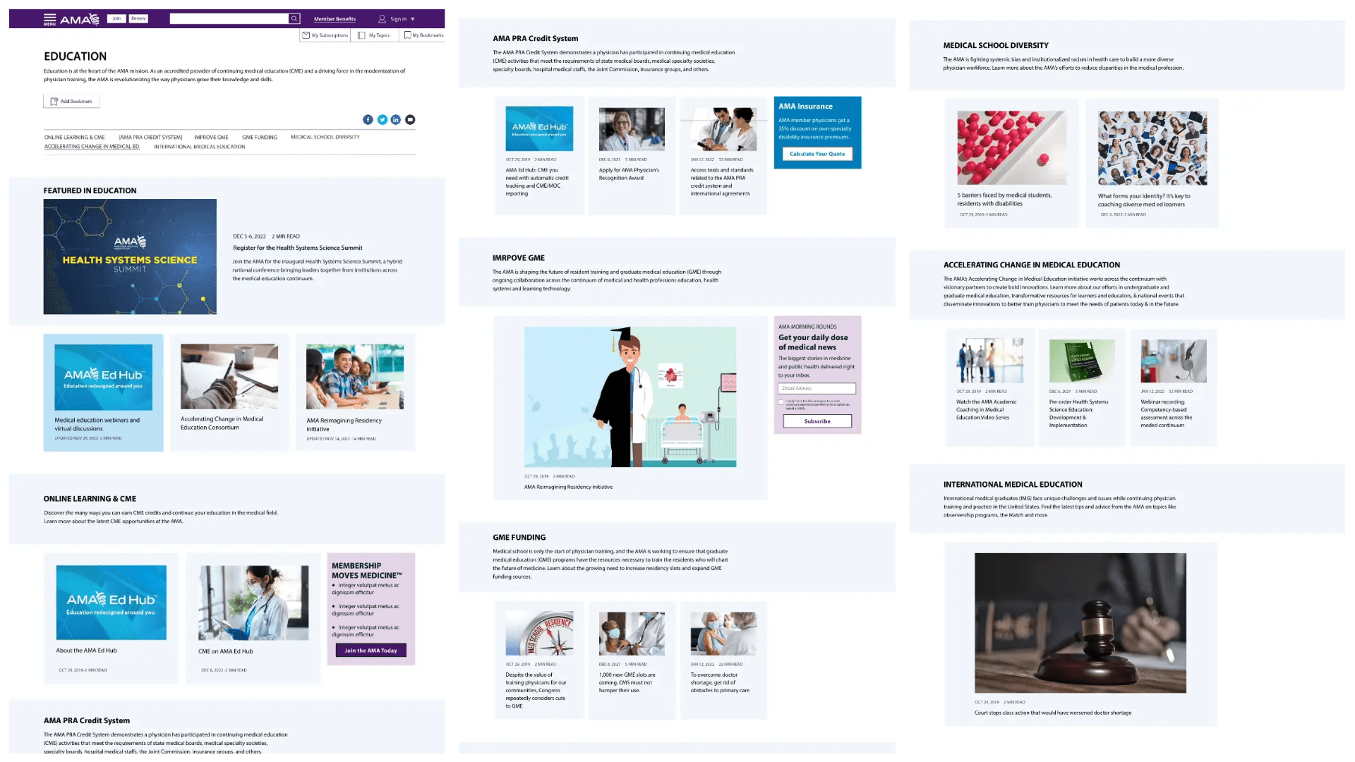
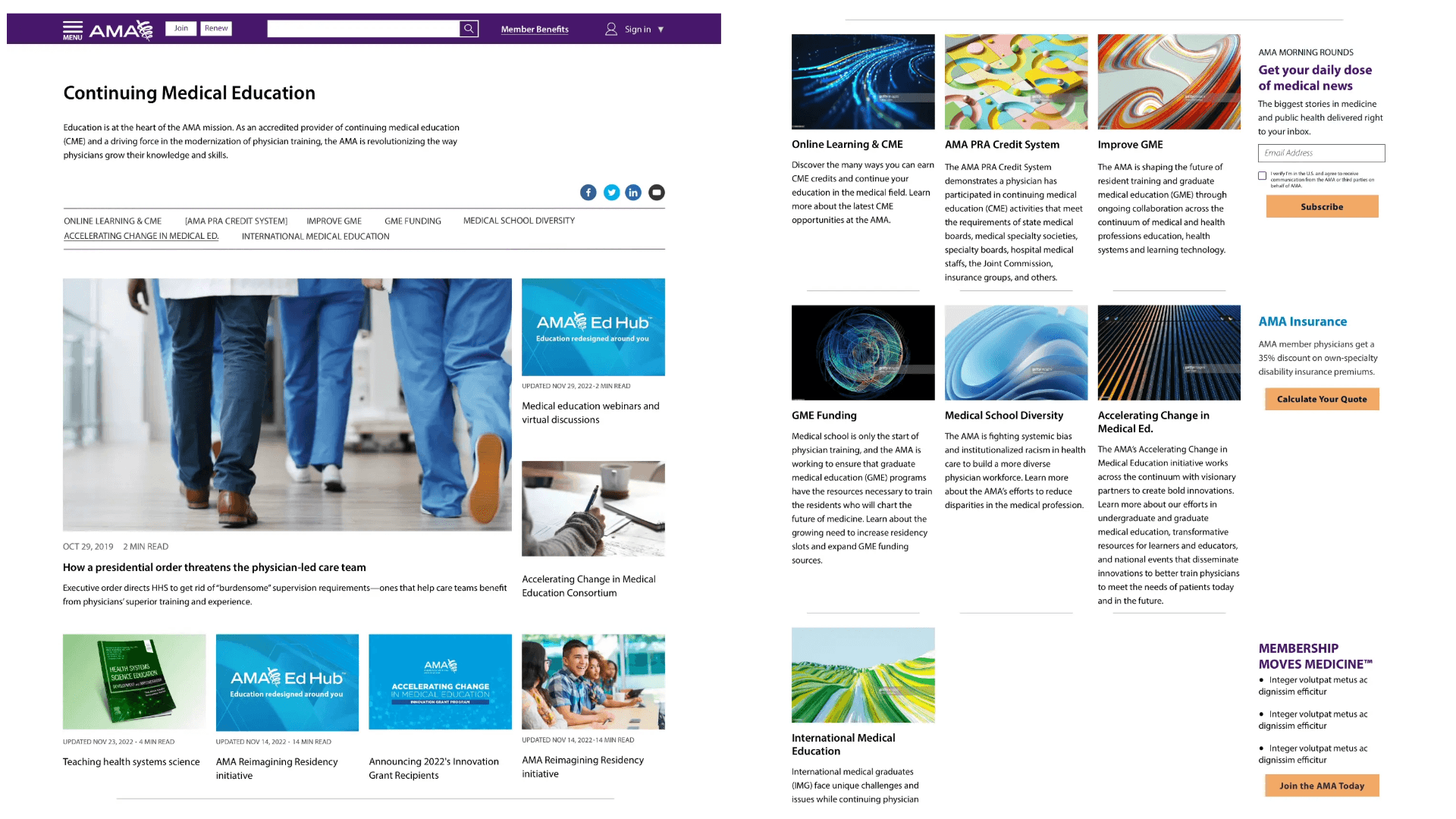
I developed four design options, emphasizing subcategories to enhance navigation clarity and the page's purpose as a wayfinding tool. The difference in the four designs lies in how the subcategories were laid out and styled on the page.
Stakeholder feedback led to revisions incorporating "themed blocks" for storytelling. "Theme blocks" were several article grouped together based on a similar theme.
Option
Option
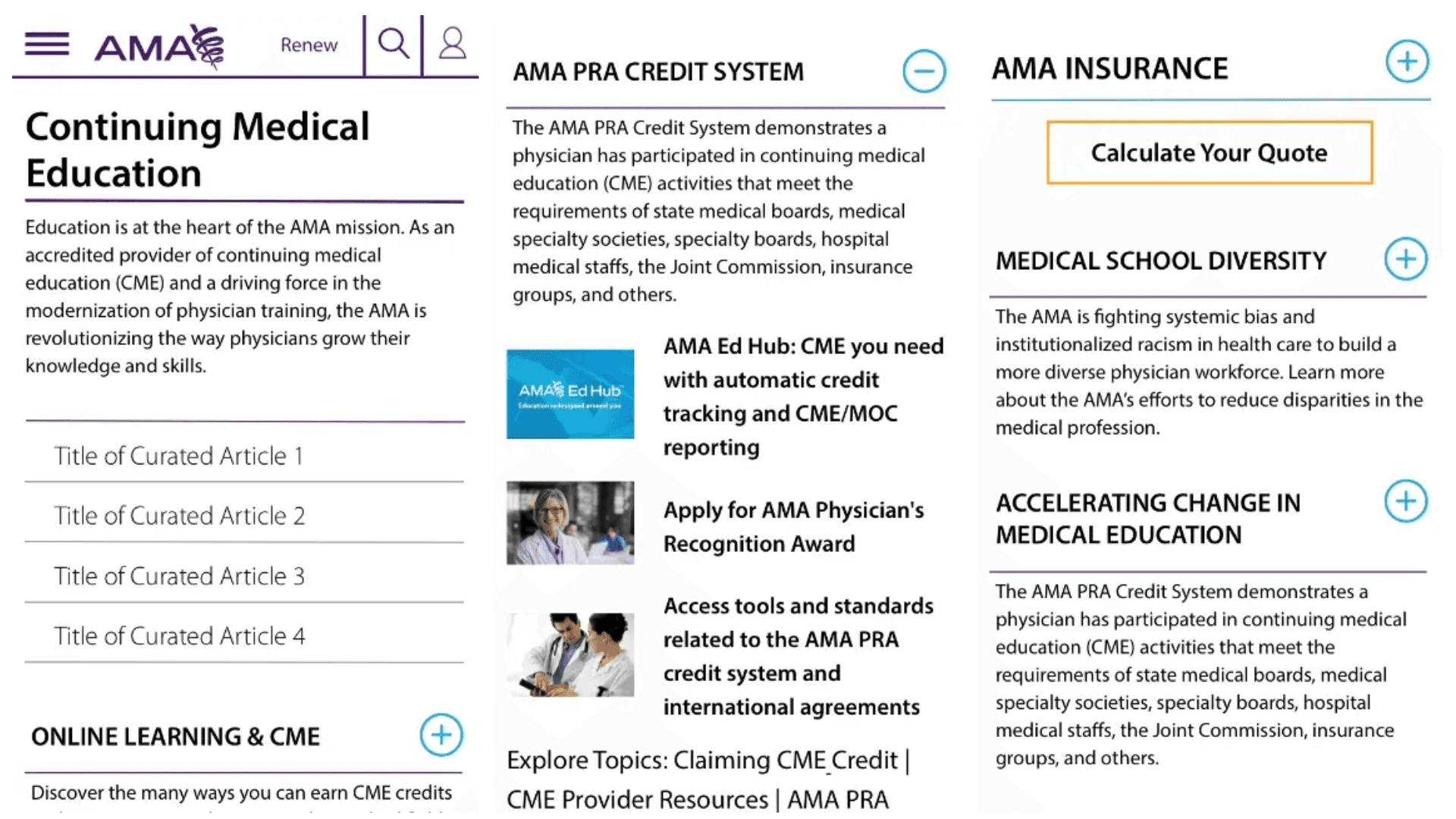
This option was the one I was pushing for the most as it got straight to the point and explained what each subcategory is with no extra fluff. Considering users don't understand a lot of our terminology, I advocated that this design would best show users what each subcategory was about.
Implementation
After review of the four designs, stakeholders picked the one they liked the best to meet their needs. I took that option and applied feedback to get the designs up to par with requirements and asks. The designs were uploaded to Zeplin for annotation, highlighting user interactions, new components, and CSS changes. I maintained active communication with the development team through Jira, Zeplin, and Microsoft Teams.
Outcome
Following development, our team conducted User Acceptance Testing (UAT), where I performed spot checks. After approval, the updates went live, and a smoke test was completed with the web ops team.
The web operations teams decided against using the subcategory blocks, which I still remain steadfast should be the point of the category pages. They exist in the CMS never used.
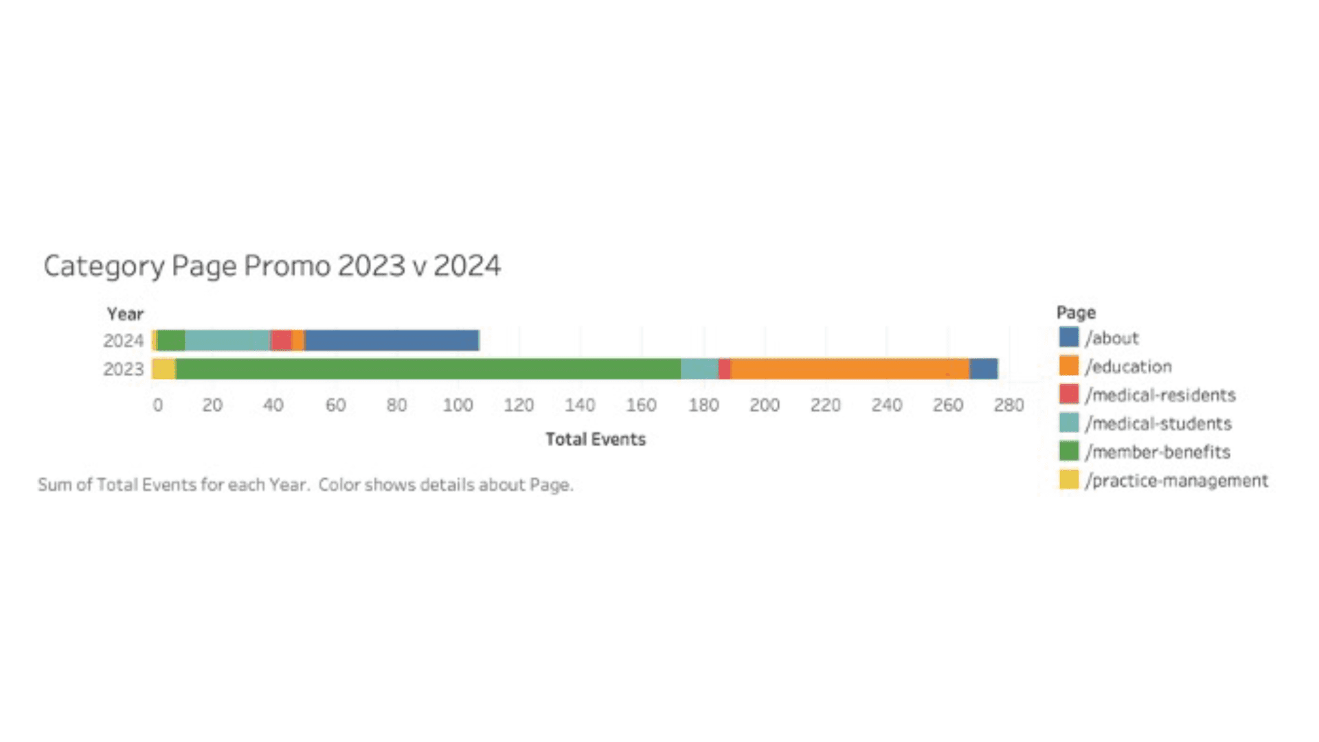
Scroll maps reveal that users continue to navigate via category pages, favoring subcategory titles while overlooking stakeholder-requested "theme" blocks.
Including this case study to show that my weakness lies in the sales aspect of design. I could not convince stakeholders to use these blocks at all and while I know that some of our subcategories don't need to be featured we could have implemented a system where we displayed them based on which ones users clickthrough on the specific category page the most. The analytics defend that my initial suggestion was correct, users visit our category pages to explore subcategories and do not pay too much attention to how we merchandise articles. I just failed to convince stakeholders of that.
