Company
American Medical Association
Role
UX/UI Designer
Duration
3 weeks
Gating Mechanism Improvement
The objective was to enhance the American Medical Association's gating mechanism, which restricts users from accessing specific content based on their audience type. The existing system had a critical flaw: when users took certain actions, they got stuck in a loop. We aimed to identify and resolve this issue, ensuring a seamless user experience. Additionally, stakeholders wanted to implement the gating mechanism on more pages but disliked the component's aesthetic appearance.
Scope & Constraints
The project scope involved updating the user interface design of the gating mechanism. We faced constraints related to maintaining existing user pathways while introducing improvements that eliminated the loop, ensuring both functionality and user satisfaction.
The business required gating tools to provide more freedom to content editors so they could change the content on the gate to explain what content was gated and sell users on why they wanted access to the rest of the article.
The old component could block a full page or block part of a page, so the new component needed to retain that ability. Additionally, the current component could display ungated/open gated materials to specific audiences, so we needed to keep that functionality as well.
Goal
Entice eligible members to join by gating access to premium content so that they sign up for memberships to access said content.
Audience
Physicians
Residents
Medical students
AMA Board members (Internal)
House of delegates (Internal)
Member groups (Internal)
Team
A.Matkovich, Lead
R.Wells, Stakeholder
M.Donahue, Stakeholder
J. Russell, A.Tamalonis, Project Managers
J. Thorne, Developer
D. Mosurak, Product Manager
N. Kumar, Quality Assurance
Process
Market Research
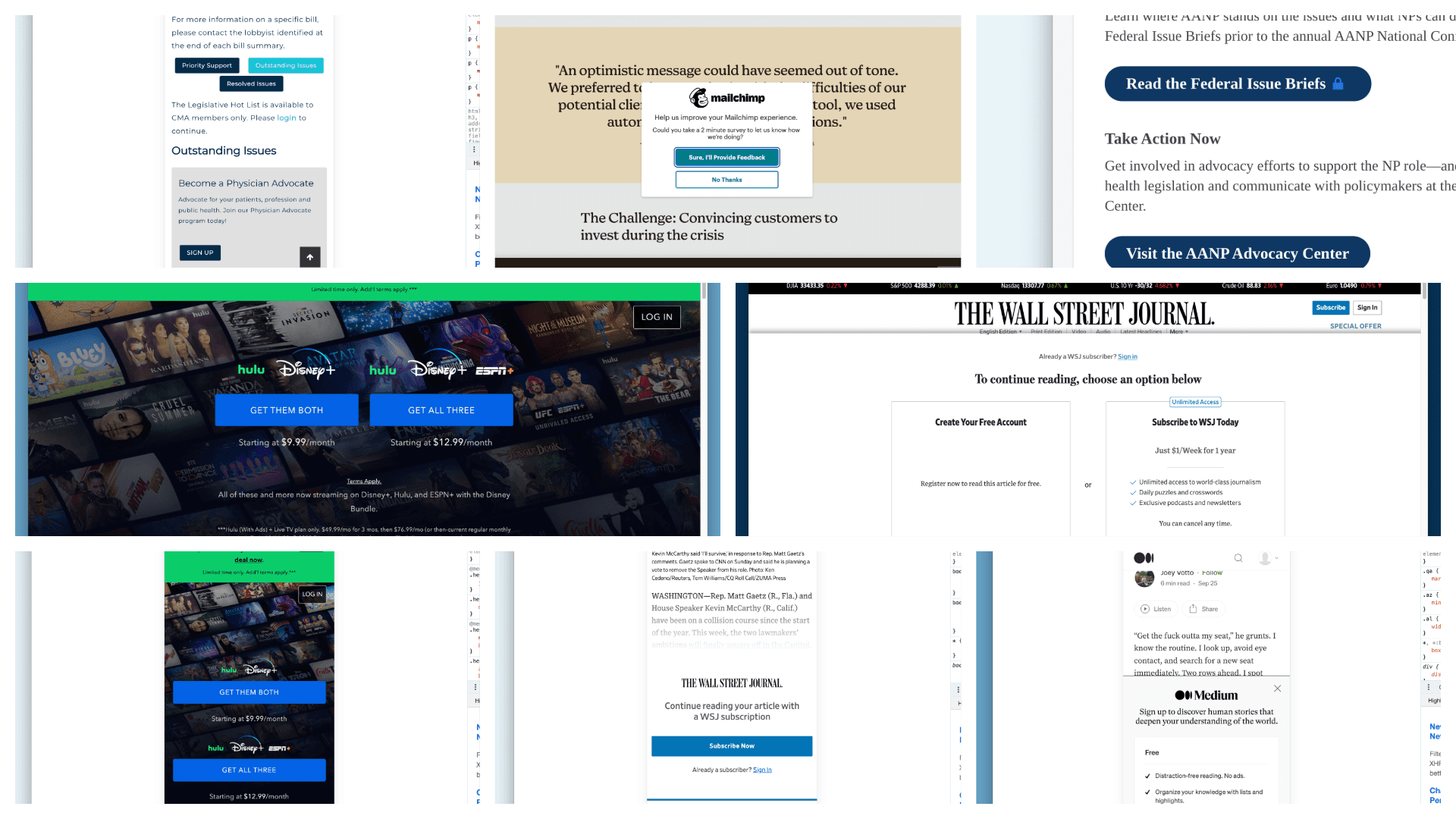
Through market research I pulled some of the attributes and elements used in gating blocks from different websites. I also was able to understand the hierarchy of the elements and how they were presented. Additionally, I was able to garner where users could navigate from a gating mechanism.
Current Flow Analysis
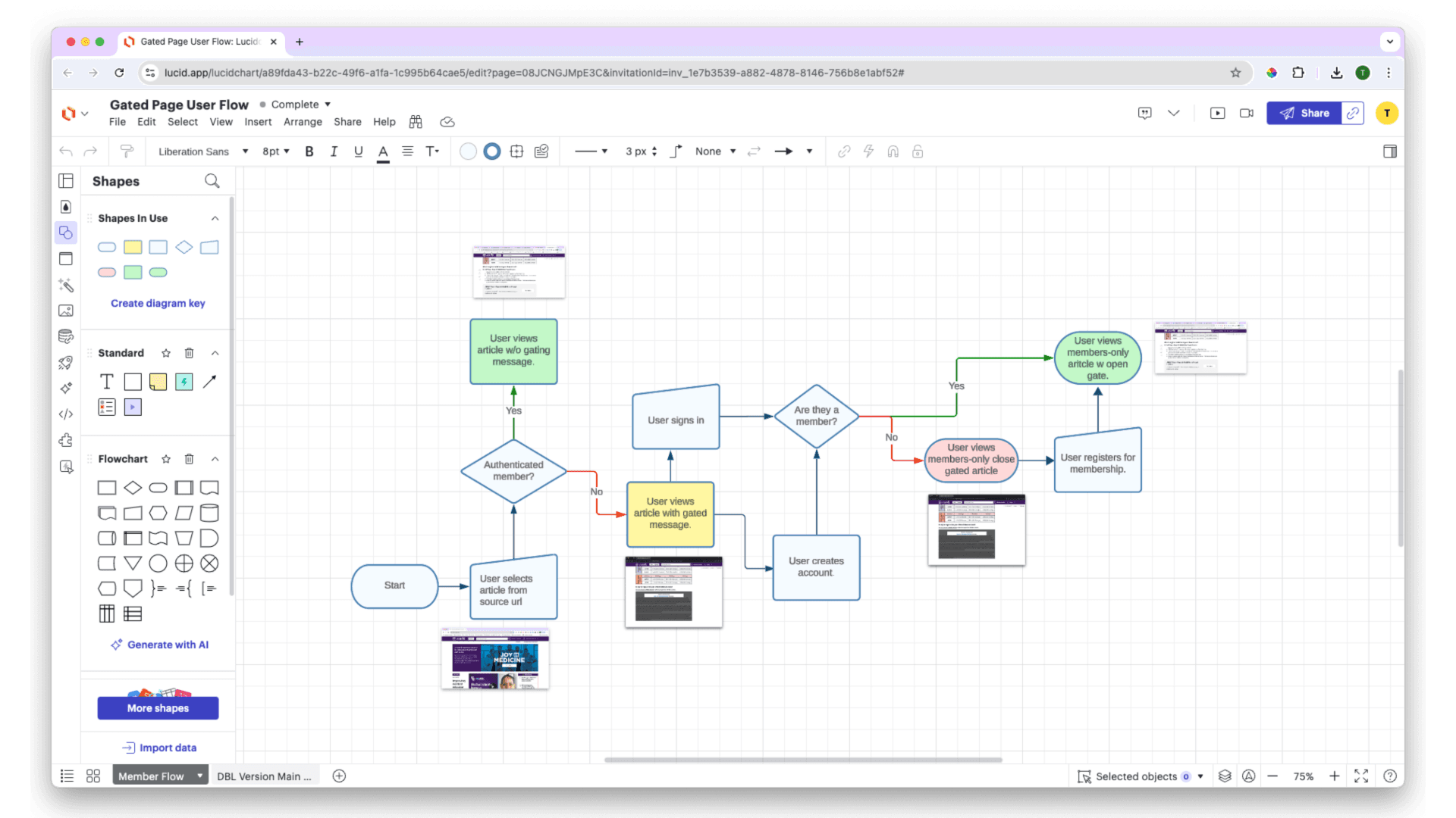
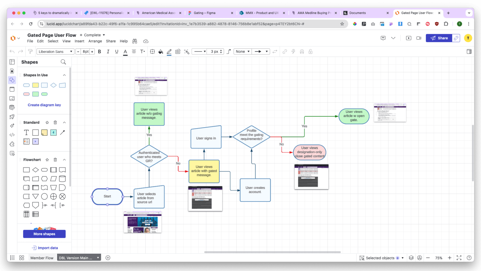
I began by meticulously mapping out the existing gating mechanism's user flow in LucidChart. This analysis revealed a problematic loop that users encountered under specific conditions, highlighting a significant UX flaw.
Redesigning the Flow
Armed with insights from the initial analysis, I crafted a new user flow in LucidChart that addressed the looping issue. This redesign prioritized ensuring that every decision a user encountered would lead to an end point—a specific page or page type.
Wireframing for Alignment
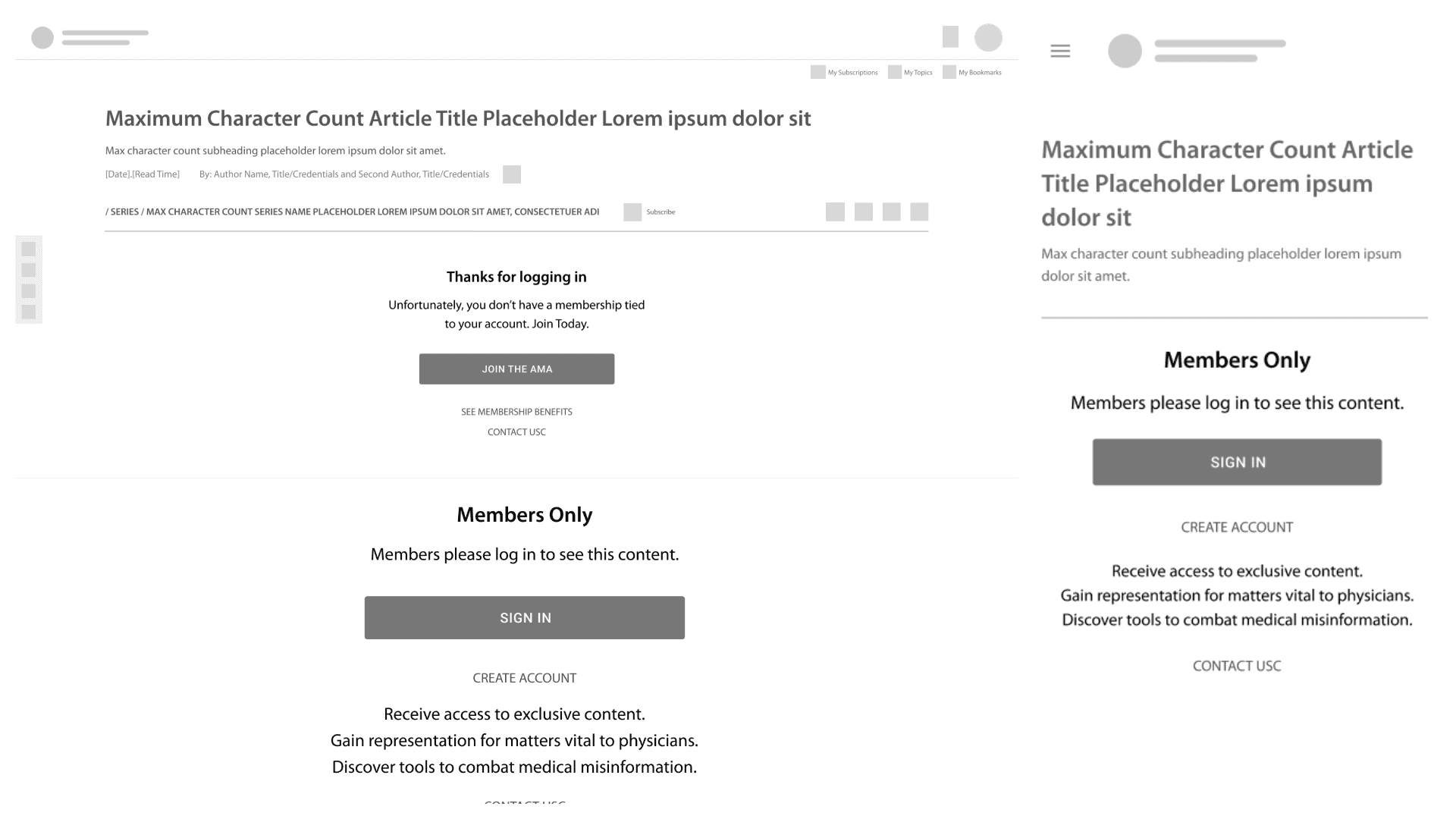
To visualize the new flow, I developed wireframes in Figma that incorporated essential screens. These wireframes facilitated team discussions on layout and hierarchy, ensuring alignment on design elements before moving forward.
Creating Hi-Fidelity Mockups
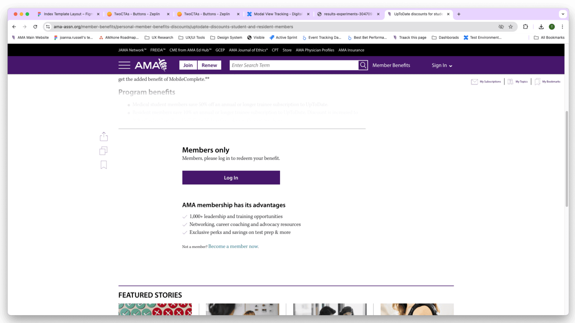
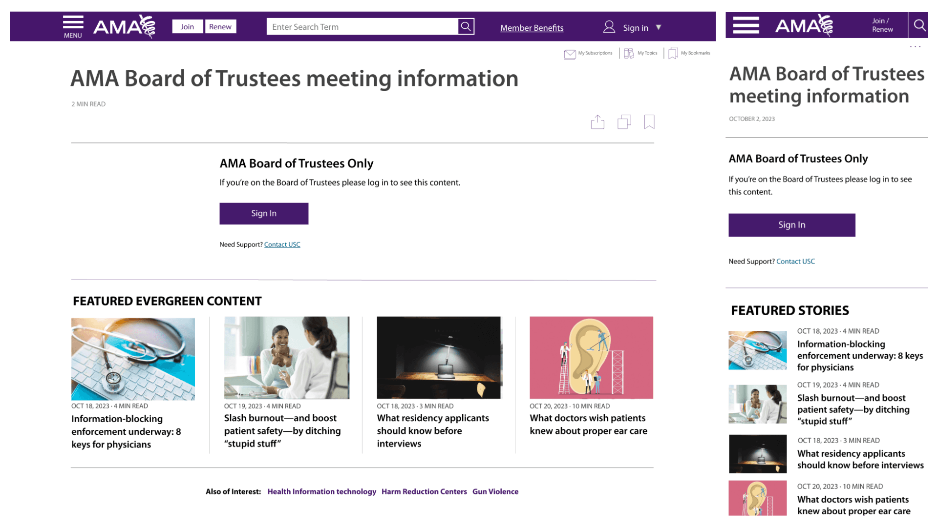
The final step transformed wireframes into high-fidelity mockups. These detailed designs demonstrated how the updated gating mechanism would appear live on the site, providing stakeholders with a clear vision of the improved user experience.
For these, I created versions that addressed the possible audiences the CMS addressed. The possible audiences in the CMS included, users with logins, members, board members, HOD members and section members who each had different permission settings that was tied to the page gating.
They also included different elements of the WYSIWYG block the content editors can use in the CMS. This approach showed all the freedom the content editors would get to explain what content was gated, why it was gated, and to sell the user on joining to access the content.
Live Gating
After stakeholders approved, I passed the high-fidelity designs in Zeplin to the product managers so they could include them in their Jira tickets along with the user story and the acceptance criteria for the live mechanism. I also made annotations regarding expected user behavior and any instances where stylings veered away from the current CSS styles.
Mobile Screens
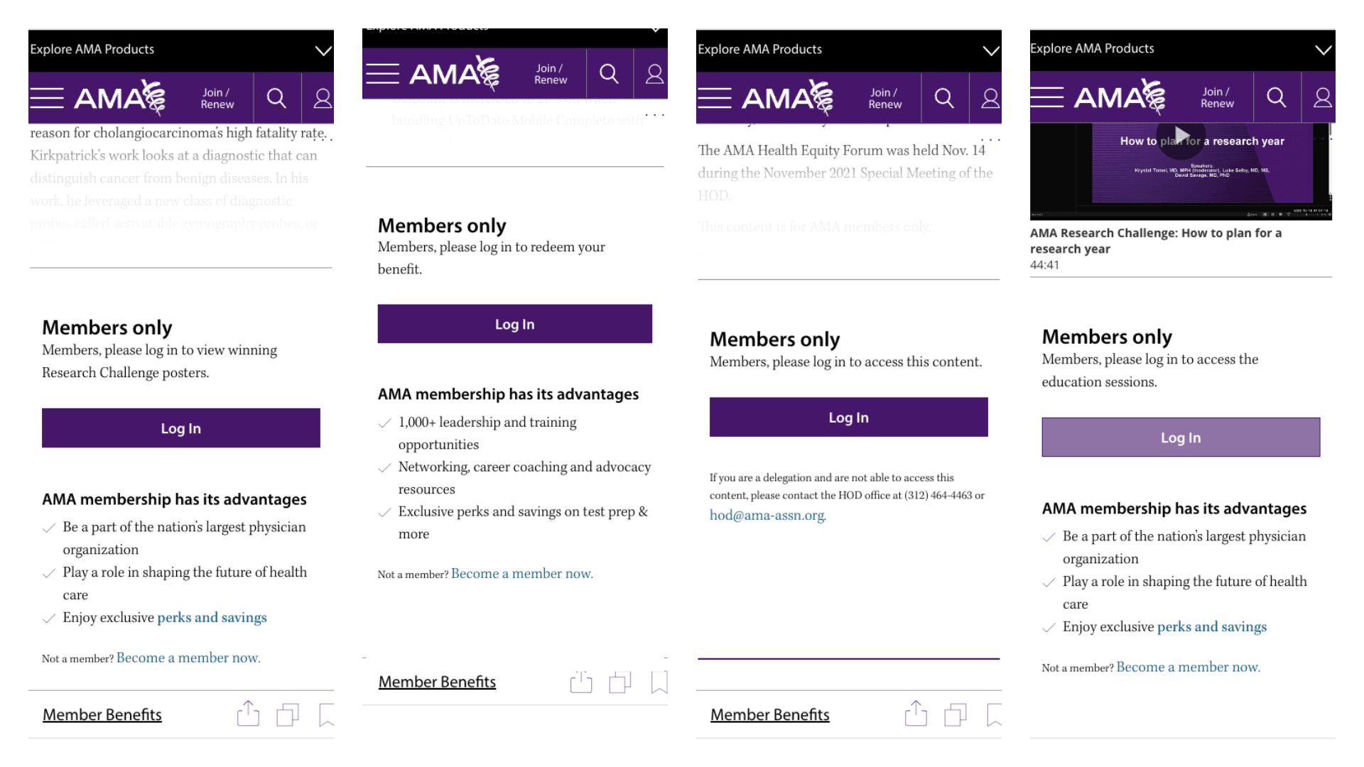
The gating feature went live in early 2024. You can see it on premium content on mobile sized screens below.
Outcome
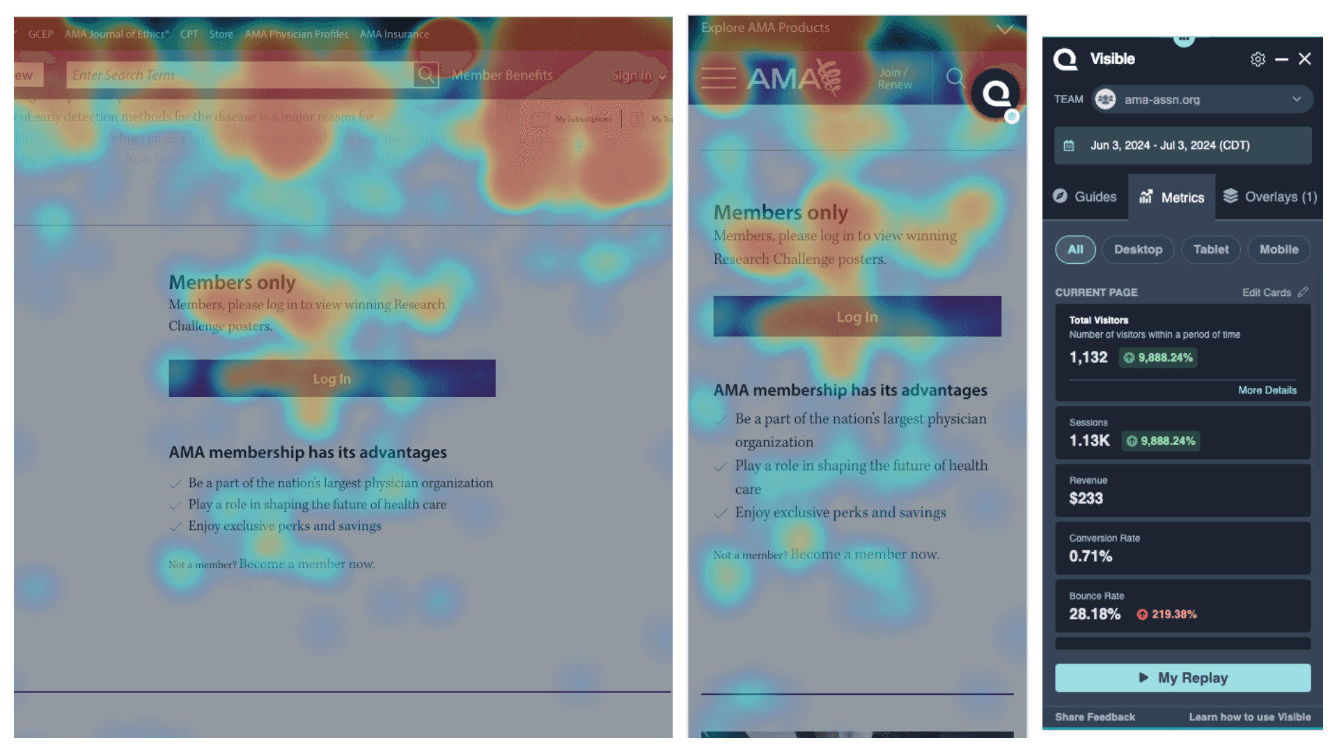
The AMA website currently employs the gating mechanism on 129 article pages. To analyze the gating feature's outcome, I examined an article featuring posters from our 2023 research challenge, published on June 3, 2024. From June 3 to July 3, 2024, the article attracted 1,132 visitors.
The heat maps revealed that the gating mechanism drew heavy focus from our users.
The bounce rate hovered around 28%, which we could decrease with further copy tweaks. Our content editors often fail to draw a clear connection between the featured content and the specific benefits of membership related to that content. I believe this would create a huge change in how our website performs in member conversions.
User Engagement
11.44%
Conversion Rate
8.53%
Bounce Rate
1.8
Error Rate
31%
Retention Rate
63.14%

