Company
American Medical Association
Role
UI Designer
Duration
1 week
Hero Component Update
Through active listening in various stakeholder meetings, I identified a persistent issue surrounding the hero component, which we refer to as the 30/70 block, that impacted multiple teams. Leveraging my down time, I designed a potential solution, to be proactive. My initial design caught the attention of key decision-makers, leading to the project's inclusion in the product roadmap.
Once the project officially began, I conducted a thorough requirements gathering process. This allowed me to refine my initial design, ensuring it met all stakeholder needs and technical constraints. In addition to the user-facing interface, I designed the corresponding CMS form for the block.
Scope & Constraints
Business stakeholders and leadership asked me to focus on the design aspects of the block and vetoed functionality I proposed to add to the block. This block appears on the home page, article pages, and category pages, so I had to keep that in mind while working on this redesign. I focused heavily on connecting the styling elements to the brand sentiment the AMA tries to exude as a professional and a source of factual knowledge and information.
Goal
To enhance user experience by repositioning the Call-to-Action (CTA) for improved visibility and expanding clickable areas within the 30/70 block to increase user engagement.
Audience
Physicians
Medical Students
Residents
Medical Staff
Educators
Health Systems
AMA Internal Stakeholders
Team
J. Russell, Lead
R. Wells, VP Marketing
J. Capaldi, Dir. Editorial Programming
Tamalonis, Project Manager
K. Graves, Developer
D. Mosurak, Product Manager
Process
The idea for this project emerged when my teammate Malcolm and I conducted a comprehensive homepage audit.
Initial Concept Development
I started by proposing quick design fixes to transform the block into something more aligned with AMA's branding.
Old Hero Component
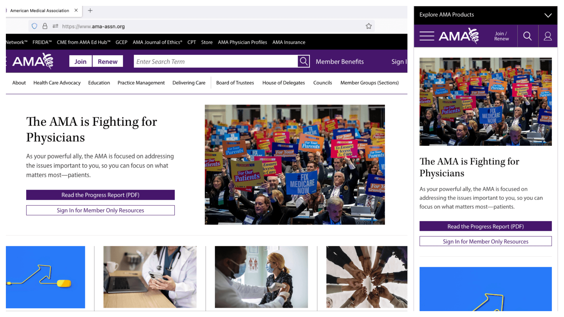
As you can see here, the button overlays the image on the z-index, blocking out part of it. It also doesn't follow the common pattern that users have a mental model for, as the CTA button hovers over the image instead of appearing underneath the text. At times, it's also difficult to distinguish that the CTA button is separate from the image. My main goal was to have this block follow the common design pattern of featuring the Title, Descriptive Copy, and then Call to Action while showing hierarchy between those elements.
Mobile Component Options
Upon receiving detailed requirements, we expanded the design scope to include previously unknown instances of the block. I created some possible options of the redesign that followed the AMA's branding and followed common user experience design patterns.
Desktop Component Options
The image shows the desktop components in two different sizes, reflecting their variation depending on the page template they are displayed on.
CMS Interface Design
After getting an option approved by leadership, I designed an intuitive CMS form for content editors.
Design Handoff and Collaboration
I utilized Sketch for design creation and uploaded the design to Zeplin for seamless developer handoff, adding annotations reflecting user interaction behavior. I also engaged in iterative feedback loops with the development team since it was the first time we proposed a design for the CMS form the content editors have to fill out to create a live version of the component. It took some time to communicate that we didn't need any layout and styling matches from the design in the CMS and we were just looking for the specific form elements and copy to be used so that content editors found the creation of this component user-friendly.
Launch and Implementation
We successfully launched the redesigned 30/70 block, which is now prominently featured on the home page in the hero spot and select article pages.
Outcome
The redesign achieved a remarkable 500% increase in Click-Through Rate (CTR), according to our VP R.Wells. Upon launch, the new design successfully replaced all existing 30/70 blocks across the website, meaning the changes were scalable. This project not only delivered significant improvements in user engagement but also expanded my professional capabilities, particularly in CMS design and data-driven decision making.
Metrics are from 11/1/2024-11/30/2024.
User Engagement
0.72%
Conversion Rate
0.35%
Bounce Rate
36.52%
Error Rate
15%
Retention Rate
45.39%


