Role
User Research, Interface Design, Prototyping & Testing
Duration
5 Weeks
E-commerce clothing customers use the software, but the company sells its software to e-commerce clothing retailers.
Team
Team Lead (M.Linton, D. Burnes), Product Owner (J. Mercy), Developer (D.Holmes), Data Scientist (H. de Paula Lopes), Tech Lead (J. LaChance)
Overview
Bold Metrics, a B2B startup in e-commerce, creates tools to help businesses sell clothes that fit well. Their Smart Size Chart lets customers input their height, weight, age, and one body measurement to get size suggestions and fit details. I was brought on to redesign this experience and brainstorm new solutions to make it more intuitive and engaging, aiming to help brands reduce returns and boost sales.
Scope & Constraints
The data scientist on the Bold Metrics team called attention to an inventory issue that Jos. A. Bank, one of Bold Metrics' clients, experienced. Sometimes out-of-stock sizes still displayed as a purchase option in their web app if the size was recommended to the user. The user wouldn't realize the item in that size was out of stock until after they returned to the item's page. The team set out to fix the issue by changing the algorithm to display when inventory was out of stock. After they changed the algorithm, they wanted to reflect this change in the design of their Smart Size Chart. I began working on several iterated redesigns for the issue.
Process
I quickly examined the interfaces of their competitors and developed several possible solutions.
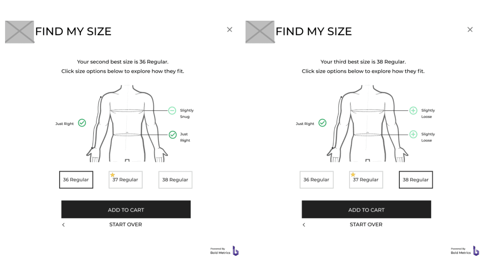
Original Design
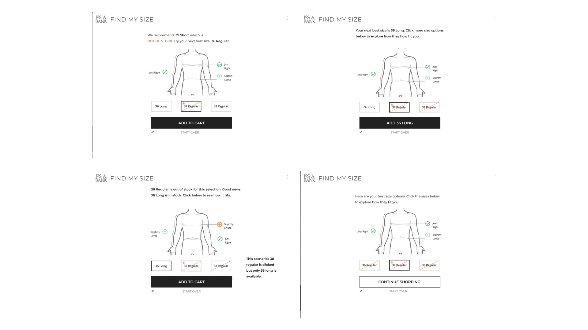
First Iteration
The proposed solution used copy to communicate that sizes were out of stock. Red highlighted the words "Out of Stock" to draw the user's attention.
We conducted some guerilla testing and found that people weren't aware they could click on the size recommendations. They also didn't see the copy at the top of the screen explaining the available options. The next redesign efforts addressed those pain points.
Second Iteration
During the second iteration, I focused on the pain points identified from the guerrilla testing and explored the possible scenarios users could encounter while trying to find the correct size.
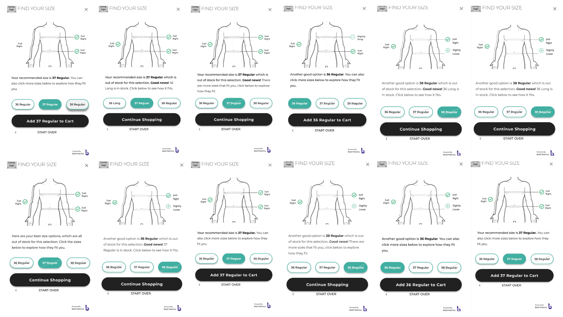
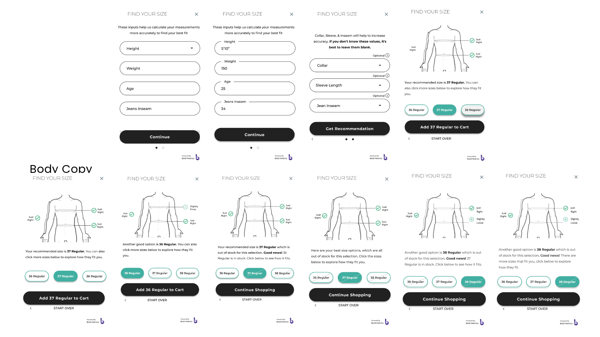
I identified six scenarios users could encounter:
Inventory fully stocked
Recommended size is sold out
Recommended size and an adjacent size are sold out
All sizes are sold out
Recommended size is in stock but two other sizes are sold out
Recommended size is in stock but an adjacent size is sold out:
Button Style Sheet
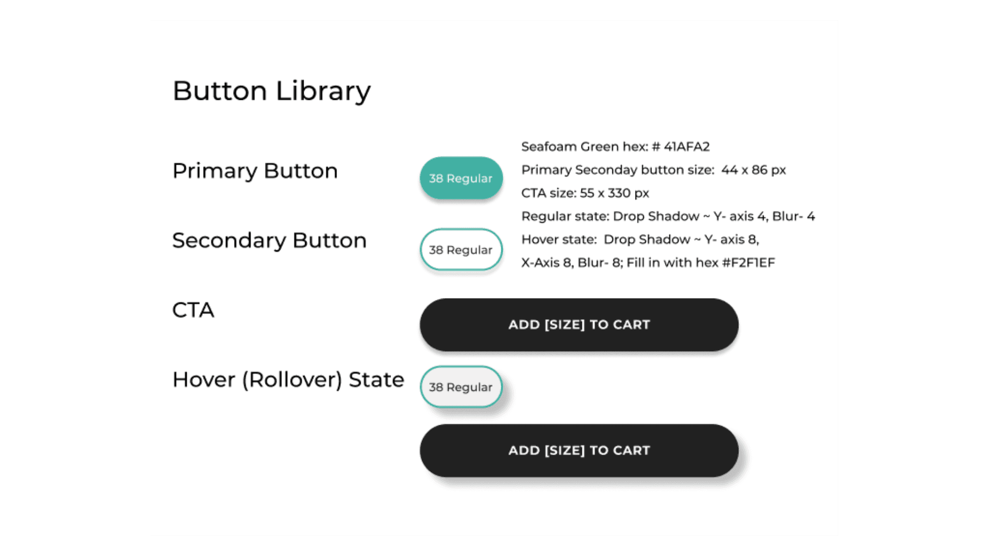
To draw more attention to the buttons, I added a drop shadow to indicate that they're clickable. In hindsight, I definitely overcorrected; this is way too much drop shadow. I created a library so that future designers could reference it.
New Step Consideration
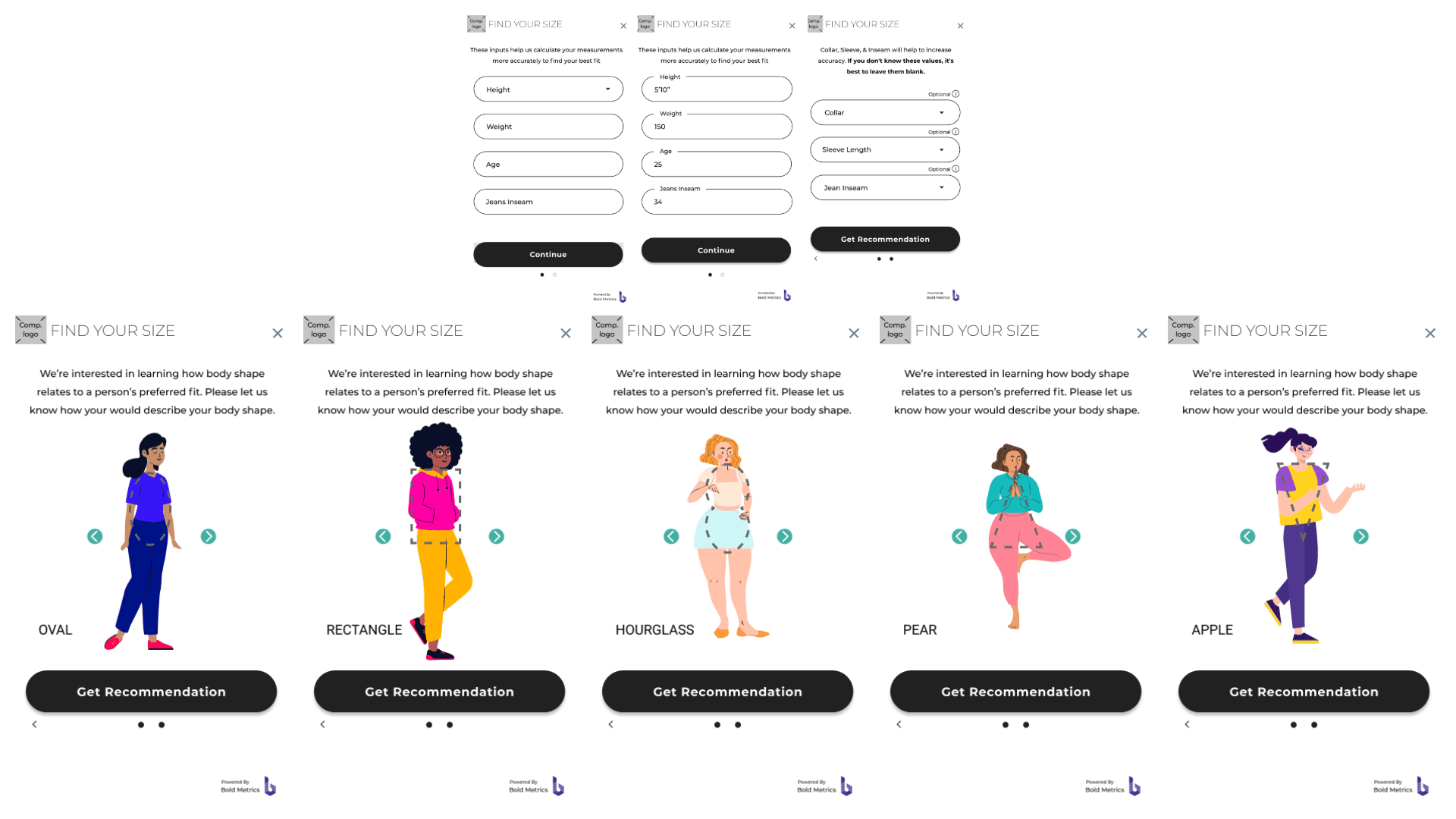
Bold Metrics wanted to test the waters on introducing a new section to their early flow, so I created some quick mockups using illustrations borrowed from Blush. The idea here is that body shape could help indicate the best fit for customers. Using illustrations from Blush adds an engaging but playful visual element, making the interface more inviting.
Final Flow with 6 possible scenarios
After receiving feedback I churned out the final designs to help solve the problem of retail e-commerce sites possibly running out of stock of certain sizes that may have been a good match for the user.
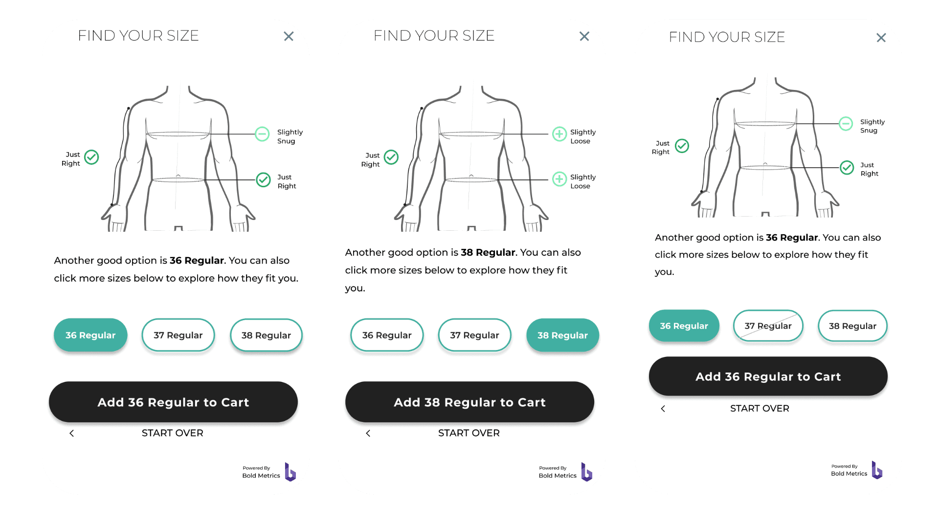
Divergent flows based on user interaction
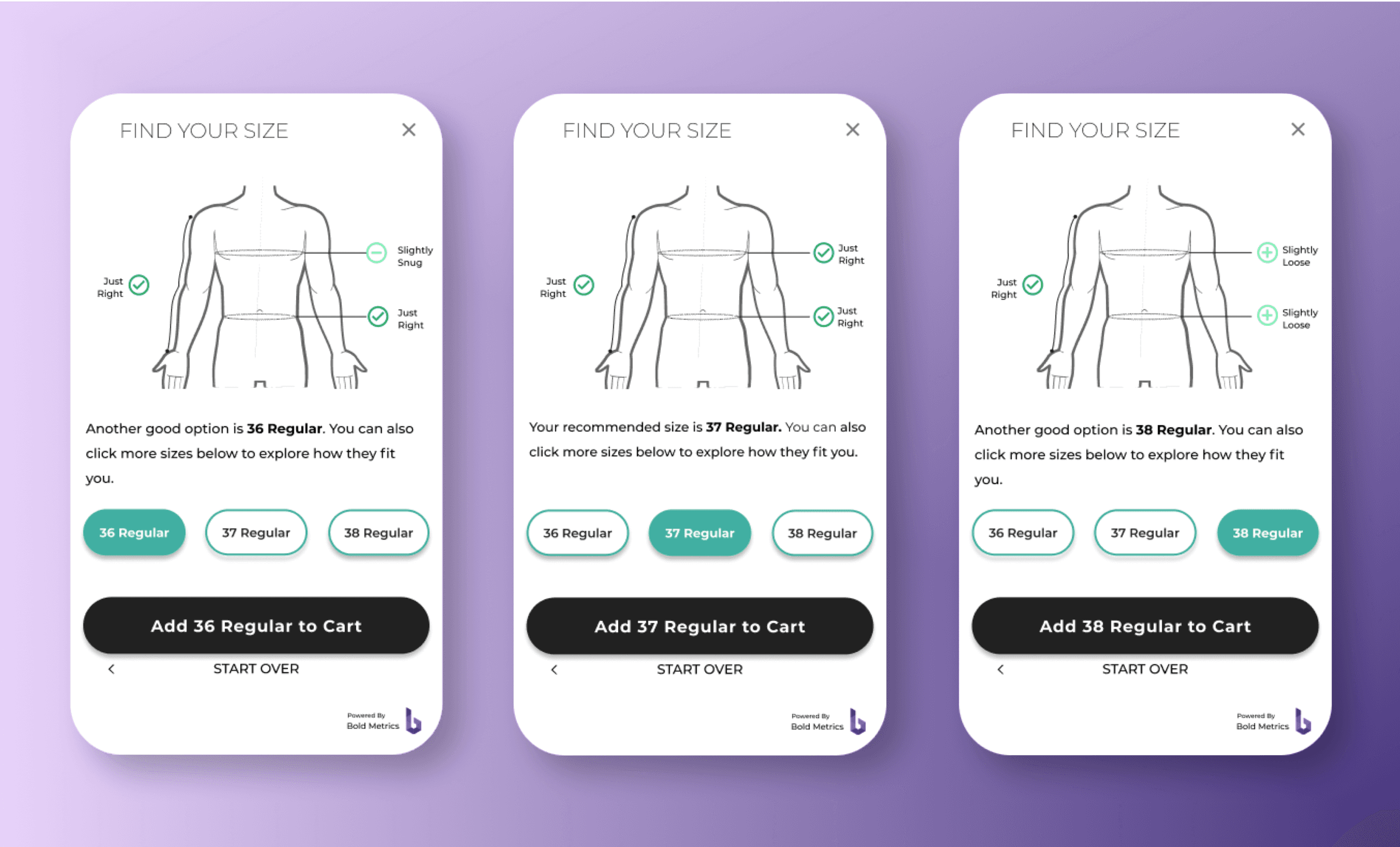
Besides the scenarios, I also crafted mockups reflecting what each sizing selection looked like.
Outcome
I left shortly after this project was complete, so I never got to see the analytics on how the redesign performed. I would have liked to learn if interaction with the different sizing recommendations increased and whether the redesign led to a change in overall sales conversions. Heatmaps would have also been helpful in this project to see where users focused their attention in the design.
